website

6 examples of website with a modern and pure design

In this article, we will compare the design of six consumer websites by targeting their weaknesses and strengths to improve navigation and usability on your own websites.

Anne-Laure CompainAnne-Laure Compain

Anne-Laure Compain

Graphic designer at Snoweb
Published on 13 March 2021 (Updated on 25 February 2022)


Please note that all images of the websites were captured at the time of the creation of the article. The website designs may have been updated by the brands.

Why create a website?

To make himself known, a merchant will set up a store and make an attractive window display. This is how his customers will notice him. Well for you, it's the same! Your website is your shop window, but online.

gagner en visibilite
Talk about your brand

When you are satisfied with a service or a merchant, what do you do? You recommend it to your friends or you leave a review on the internet. The same goes for your website. The more visible you are on the web, the more people test, give their opinion and testify of the quality of your service.

referencement site internet
Make your brand visible

Having a website is good, but it is better to be visible! We are talking about natural referencing or SEO. This point is a thorn in the side of many entrepreneurs who do not see the value of working on it. SEO, when it is well done, allows you to appear on the first page of Google search results.

credibilite
Bringing credibility to your brand

From your website present your services, your achievements, your skills, etc.. Prove that you are an expert in your field to bring confidence to your customer. Tell your story on your website, add customer reviews, photos: in short, show yourself and stand out!

1. Qonto


What is Qonto?

Qonto is a 100% online bank for entrepreneurs and startups, which offers an account opening in a few clicks and the instant reception of the IBAN. Thanks to its mobile app, it offers to follow its account live.

The assets of the website

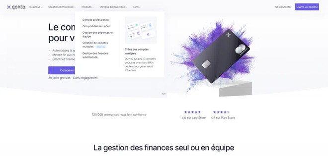
1. The menu

  • The fixed or floating menu: it remains in place when users scroll down the page. This type of menu is ideal for one-page websites because it allows access to other pages quickly and without having to scroll through the page.
  • Drop-down menu: a menu in which a list of additional options opens when visitors hover or click on an item. This option is suitable for websites with a lot of content. But be careful not to have a menu that is too high, which could hide the rest of the web page and make your page less readable.
  • Illustration in the menu: This is a way to catch the eye and capture the user's attention. The illustration allows you to bring more information by accompanying the image with a caption.

A little graphic advice: the overlay. When the menu appears, apply a light gray filter on the area corresponding to the rest of the page, this will keep the attention on the choices offered in the menu by a contrast game.

website example qonto

2. Simplicity of the blocks

We advise you to create few different blocks on the homepage but they must be well constructed. Let's take the example of block 1:

  • impactful image with the dominant colors of the website.
  • title with a bold font and a font size greater than 50px.
  • list of three strong points: a list of short concepts will always have more impact than a paragraph. It is faster to read and therefore faster to understand and remember.
  • 2 action buttons: here they allow to display the subscription prices or to continue reading in the page.

UX tip: to convert the prospect into a customer, use one of these buttons to redirect him to the contact or subscription page for example.

website example qonto

3. Overlaps

Overlap is the overlapping of several graphic and/or textual elements, such as a background image, text, illustration and buttons on top. This technique gives the user a dynamic feeling and makes navigation more fluid and pleasant.

Small statistical point:

It is now a fact that our brain remembers a visual, an image much better than a written or heard text. The impact of an image will therefore be much greater and its meaning understood more quickly than a text. Remember that only 10% of people remember information presented orally three days after receiving it. Similarly, if you combine a visual with text, more people will retain the information. For example, with a photo, 65% of people remember the topic three days later.

So, to make your website "memorable" don't forget that images and animations immediately catch the eyes of visitors.

website example qonto

2. Stripe


What is Stripe?

Stripe is a secure web-payment infrastructure that allows your customers to pay simply by using their credit card without leaving your website. Stripe is a simple way to accept online payments, with no setup fees or monthly fees; only a commission is charged by the provider on each transaction.

The assets of the website

1. Web version

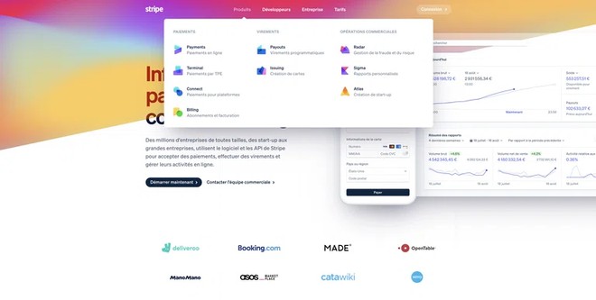
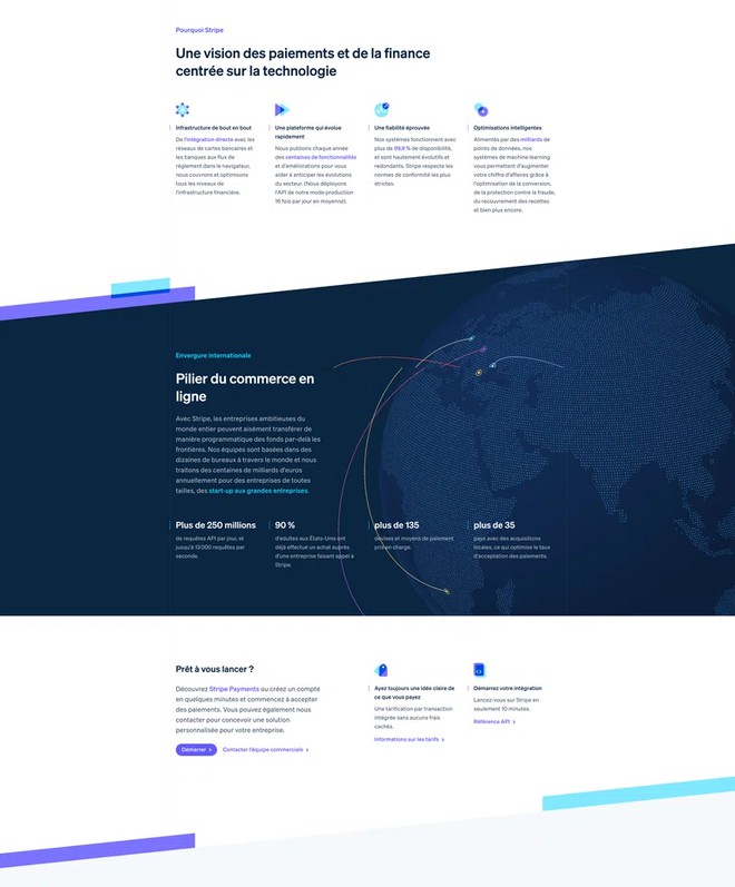
  • Stripe integrates animations in its blocks, which attracts the eye of users and allows them to stay on the block to read the corresponding text.
  • Floating menu hyper design and attractive thanks to its many colors.
  • Presence of logos of well-known companies using their solution in 2nd position on the website brings a feeling of trust and will help convert users.
  • Design: the cuts between the blocks in diagonal going up to the right brings dynamism to the page.
website example stripewebsite example stripe

2. Phone version

  • Dynamic menu in the form of a pop up with a light shadow underneath to detach it from the rest of the page.
website example stripe

Negative points

3. Web version

  • "Connection" action button not very visible because of its white color in opacity
  • Poor readability of the main title because of the color and the diagonal cut of the background which disturb the reading. We find the same problems on the mobile version.
  • Menu not fixed, that is to say that when we scroll in the page, the menu does not remain fixed at the top of the page. Even if the home page is not long, it is disturbing to have to go back to the top of the website to access the menu.

Little UX advice : no matter how long your page is, we advise you to always have your menu in the fixed header. It improves the user experience, by avoiding having to search for the menu at the top of the page.

website example stripe

3. Airbnb


What is Airbnb?

Airbnb is a platform for renting accommodation (apartment, house, cottage etc.) between individuals around the world.

The assets of the website

1. Web version

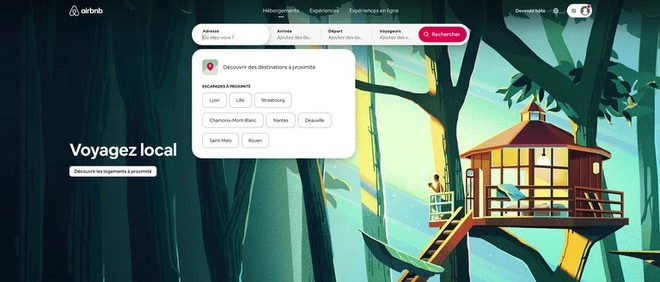
  • Airbnb plays on the beauty of the main illustration, which changes regularly, to attract the eye. The light of the diagonal illustration also directs the eye to the accommodation search field.
  • The accommodation search field looks nothing like the classic fields of hotels or other booking websites. The design is clean, modern and discreet. Upon clicking on the search box, a drop-down menu appears to display city suggestions, calendars and travelers. In addition, the "search" button showing only a magnifying glass turns into a button with the text "search" when clicking on one of the fields. The search is done quickly in 4 clicks for an optimized user experience!
  • Fixed menu when scrolling through the page.
  • Suggested 8 cities on the second block illustrated by modern illustrative thumbnails.
  • Block with a dynamic mosaic layout.
website example airbnbwebsite example airbnb

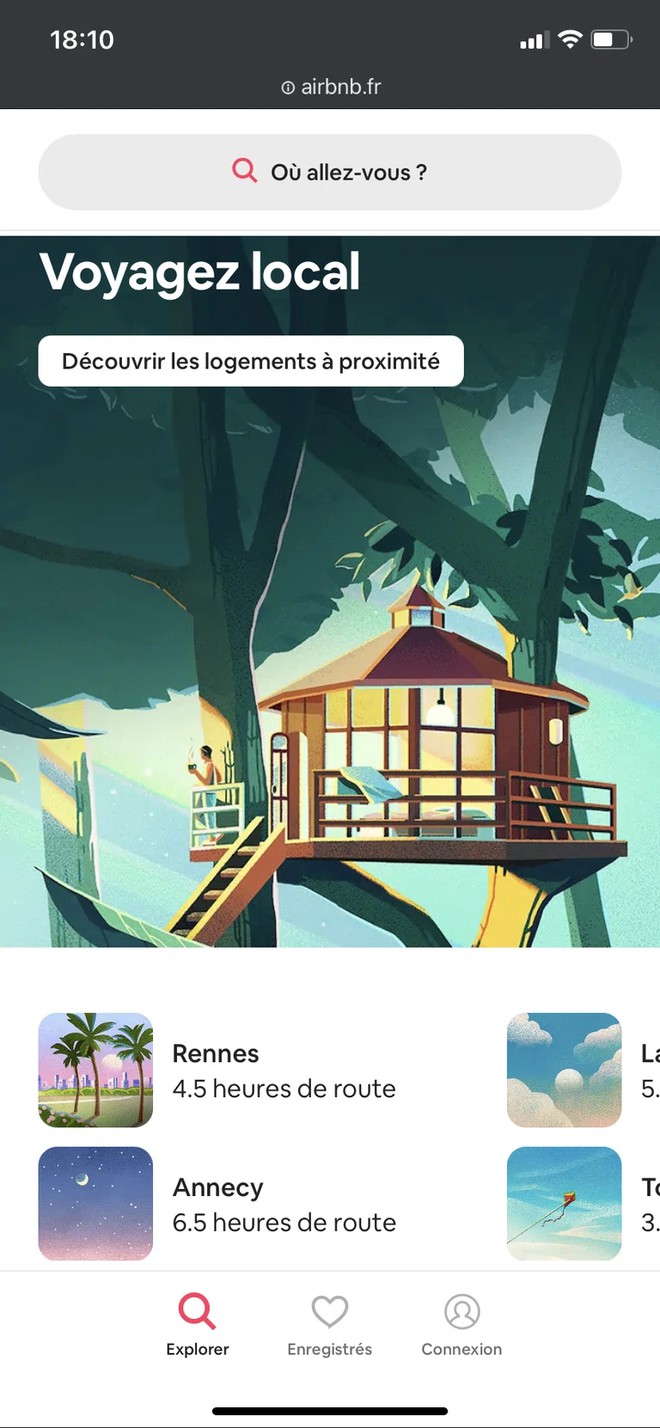
2. Phone version

  • The dynamic block present on the web version is transformed into a carousel just as modern and dynamic in design.
  • When you scroll, 2 menus appear: one at the top that allows you to search for accommodation and one at the bottom that allows you to connect, see your favorites and finally return to the top of the website. Very practical for the user!

Good to know: we didn't find any obvious design or UX flaw on this website!

website example airbnb

4. Wagtail


Wagtail, what is it?

Wagtail is a CMS designed with Django. It allows you to create web pages easily for different types of websites. With Wagtail, you can create a website, a portfolio, a blog, an e-commerce or a documentation.

The assets of the website

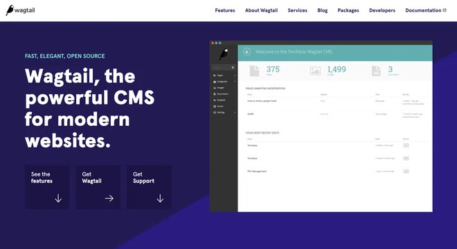
1. Web version

  • Micro-interactions: Micro-interactions are small animations on elements like buttons. They allow to attract the visitor's attention or to incite him to click.
  • Colorimetric choice: the association of turquoise and purple, two complementary colors creates a dynamic that attracts the eye.
  • The diagonal rising to the right makes the background of block 1 very dynamic.
  • The interface preview shows the product to the customer.
  • Social proof: show customers who trust the brand in the second block: important proof of value because these are customers known all over the world.
  • Targeting prospects: developers. The text display is in the form of code + main action button in the "documentation" header for developers who will use the tool.
website example wagtail

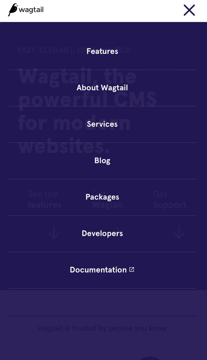
2. Phone version

  • Adaptability of the blocks for the mobile.
  • Simplified navigation.
  • Dynamic carousels to display partners' logos.
  • Dynamic menu in the form of a hamburger menu (a technique that consists of hiding the menu behind a button to save space and ergonomics; generally three parallel lines).
  • Alternation between blocks on white background and on purple background to make the page more dynamic.
website example wagtail

5. Apple


The assets of the website

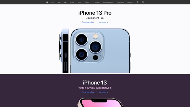
There is no more minimalist than Apple in its design, its marketing and especially its website! The latter is ultra simplified and very ergonomic.

On the homepage, you can always find the latest product above the waterline with a link to buy it. At Christmas time, Apple offers ideas for gifts to offer.

The pluses of the navigation on the Apple website: a simple navigation bar with only the different product lines and a discreet shopping cart icon. Everything else is in the footer, where you find all the secondary links of the website.

Moreover, the page design is ultra pure: black text on a white background or vice versa, big titles, a big photo and above all a lot of white.

Note that not having white space on a web page tires the reader's eye!

website example apple

6. Respire


On the homepage of Respire, we find all the essential elements of an e-commerce namely:

  • A promotional banner in the first position
  • A promotional code in the menu
  • The flagship products
  • Products of the moment: Valentine's Day, Christmas, Mother's Day, etc.
  • The complete range of their products
  • A promotional code when subscribing to the newsletter
  • The strengths of e-commerce: delivery, contact, secure payment
  • Customer reviews
  • The community: the people or the press who talk about the brand

In terms of design, color and typography, Respire respects the universe of their products. Namely, natural products, committed, recyclable and good for the Planet.

  • Colors

The colors are not aggressive but pastel. They use natural colors, for example, sand for the yellow or plant for the green

  • Typography

The typography used on both the website and the product packaging are well readable and simple. There is no superfluous, we go to the essential!

The negative point that we can report on this site is the lack of space between the elements, such as products that are stuck to the titles
website example respire

Through the analysis of these different websites, we realize that having a website is essential today, we know it and you too! Now the important thing is to build your site and think about its content. Think about what your target wants to read in order to bring him the answers. In summary, you need :

  • an informative textual content
  • well placed action buttons in the right color
  • animations to attract the eye
  • colors in line with your brand / product
  • well-marked values in your site
I want to launch myweb application