What typeface to choose in what size and color? Where to put the "call to action" ? How to make a good contact form? So many questions that we answer in this article that will help you boost the web design of a website.

Ergonomics comes from the Greek word ergon which means work and nomos which means law.
To make a parallel with everyday life, when you sit in your sofa, the armrest will be at the right height, the depth of the seat will be the right size and the cushion will be soft as you wish. Well, that's ergonomics.
Ergonomics is the fact of designing and optimizing an object in order to facilitate its daily use. For a website, we will try to respond effectively to the expectations of a user so that it is a comfortable navigation. Ergonomics is based on 4 pillars: utility, use, design and satisfaction.
If the basic rules of usability are not respected on a website, it will not hold the attention of users. This is why users leave a website, often because of lack of time or annoyance:
Each of the points is detailed below with concrete examples.
Do you know what the waterline is? It's the space at the top of the website, the part you see when scrolling through the page.
Well, in this area, display a simple and clear slogan that will describe what your website sells.
Thanks to this slogan, the user should understand at first sight what the website is about.
"But why so much white space? It's a waste of space, we could put advertising or text!"
Well, no, white space is essential for the eye to focus on important information. It makes the content more readable. But it is still important to gauge the amount of white otherwise the user will have a feeling of emptiness not pleasant.
Here is a simple example to show that white is essential to highlight an element.
Image without white: can you see the Maybelline logo?
It's better now, isn't it ?
As you may have noticed, spacing the elements from each other makes it easier for the eye to distinguish them.
Do not add too much animation on your website. A web page that moves in all directions does not make you want to stay (unless it is extremely well done, but few sites manage to do so). If you choose to put animations on your website, choose relevant animations that give value to your texts. They should not just be pretty and decorative, they should serve the understanding of the page.
Here are some tips on animations to do on a website.
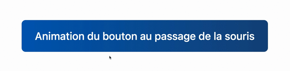
A little tip: think about micro-interactions! They can be a good compromise to make your website "move" without it being too much for the user. Microinteractions are, as the name suggests, small animations on buttons or icons. Here is an example:
When the mouse passes over the icon, it is animated and opens.
Unify all the pages of the site so that the reader is not lost during his navigation, that he does not think he has changed the site by just changing the page. This is done through the color of the header, the colors of the page and also the typography.
At first glance, we must be able to hierarchize the elements of a web page. This is done by a hierarchy of titles, but also by a summary for a blog post.
Let's take the example of this blog article, a summary is located at the top of the page. It will allow the user to have a summary of the whole article in a few seconds and if an element of the summary interests him, he can go there in one click without having to browse the whole article. Then we have the titles and the text:
Between these elements, there must be a relationship of size so that the eye sees the structure of the page.
In a book, the paragraph is not bigger than the title of the book, and well in the web, it's the same.
Use a font, or typography, that is very legible. Use only one typeface and play with different weights (light, normal, bold, italic). For the more creative, do not use more than 2 fonts on your site.
Think of simple and sans serif fonts for your paragraphs, they are very readable and offer many weights to put words in bold or quotes in italic.
Here is a small selection of typefaces available for free on Google Font and having a good readability:
For your titles, allow yourself a little bit of craziness! Use a more classic serif typeface. This will help reading because the eye will recognize paragraph titles more quickly.
Here is a small selection of typefaces available for free on Google Font and having a nice readability:
Here is an article to improve the content of your texts.
Use elements to clarify your texts like :
| Type of content | Example |
|---|---|
Bullet point |
|
Numbered list |
|
Blod | Lorem ipsum |
Italic | Lorem ipsum |
Quote | Lorem ipsum |
Link |
Colors have a meaning. Indeed, the language of colors allows us to know which color to use in which circumstance. For example, to encourage a user to act quickly, in an emergency such as during a sale, we will use the color red.
But let's move on, here we are talking about contrast. It is important to play on the contrast between your background and your titles.
So that all Internet users can see your content correctly, you must respect a rule: the contrast between the background color of your web page and the color of your text must be at least 4.5:1.
Let's take the example of a website with a dark background:
You can find more details on "The W3C's Web Accessibility Initiative" rules
Color is not perceived in the same way by everyone, so it should not be the only element to convey information. The example of an error message is perfect to illustrate this point. A simple red color should not be enough to announce an error, an attention icon or a cross should be added.
Finally, when you have chosen to work with a color, think of creating a large palette of this color, going from white to black (see picture below). This allows you to have a cameo of color. For a website, it will allow to have only 2 or 3 colors but, on different shades. It will seem to have several colors but, in reality not.
For example, with a medium or dark background, such as blue, use white text to make it stand out. As in the example below.

Today, more than half of all internet searches are done from a mobile or a tablet. A responsive design is therefore essential! You don't want to disappoint your readers with a frustrating user experience or a slow loading site.
Optimizing a website on a computer is not the same as optimizing it on a mobile! Beware, your website can be highly optimized on computer but not on mobile. And yes, you can have a very fast site on computer and very slow on mobile.
This is due to :
To improve the SEO of your pages on mobile, see the article on page loading speed.
You have to think that not all mobile screens are big and not all people have small hands! So to avoid that some people click on 2 buttons at the same time, there are rules to respect:
Use the Google Mobile Friendly toolto know if your website is optimized for phones.
Who likes to wait for a web page to load? You like me, when it happens we click very quickly on the previous button to go to another website. Nowadays, we are so used to all websites going fast that we are very quickly annoyed when we come across a slow website.
You must therefore have a fast website to :
When you ask your user to contact you via a form, for example, you must follow a few rules of ergonomics:
In summary, avoid putting many fields on your form. If you can avoid using a form, that's even better. But if its usefulness is paramount, just think about it.
A little tip: if you need to ask for a person's date of birth, forget the 3 drop-down lists to choose the day, then the month and finally the year! Split everything in a single field in the form of a calendar.
Here is an example of a simplified contact form:
On this form you can see the mandatory fields indicated with a red *.
When you set up a form, don't forget the confirmation message! It can be presented in different forms such as :
Display a message next to the button to indicate that the request has been taken into account.
Display a confirmation window at the top of the page
Redirect the user to a confirmation page
Having an intuitive menu is good, but giving the user the possibility to do a text search is a plus. By doing this search, they are sure to have access to the information they want.
If you opt for this search field, place it at the top of your website. But why at the top? Well, simply because Internet users are used to finding this field at the top of the page, like on the Google search.
For your search button, stay classic with "search" or "start search". Any other type of text can mislead the user, he may think it's an action or newsletter button.
It is important to avoid having 404 pages on your website, it is disappointing for the Internet user to find a page that no longer exists. However, if you customize your 404 page and it is attractive or allows you to go elsewhere on the website, it is a very good practice.
As on the example below
It is important to know that the best web pages are the best ranked by search engines.
The objective of any search engine is to respond to a request from the Internet user. Even if your site has the best answer for the user, the search engine will not systematically direct the user to your site if it does not meet its selection criteria, which includes ergonomics.
Thanks to the improvement of the ergonomics of your website, you improve :
To enlighten you on another point, ergonomics is not only improved from a design point of view, but also from a technical point of view!
As you have read through these 12 examples of improvement, usability is an essential work for your website. Whether it is to please Google and be better referenced. Or to please your users and make them take action.
Go back to the basics of how to use a website and stick to them. Internet users are used to certain practices and will therefore do them intuitively on websites. For example, the "login/register" button that is always found at the top right of the menu!
Find all our articles on web design


Anne-Laure Compain

Anne-Laure Compain

Anne-Laure Compain

Anne-Laure Compain
Anne-Laure Compain
Anne-Laure Compain