UI design, UX design, what does it all mean? Everyone is talking about it and it is more and more in the air.
Well yes, these two closely related fields allow us to push the user experience to be as pleasant and intuitive as possible. All this to make the user feel good and confident on the site he is browsing.

Anne-Laure Compain
What if I start by explaining what UI design is?
UI design stands for User Interface. The UI design is all the work done on the interfaces that the user will browse. It concerns the graphic and visual aspect of an application or a website.
In UI design, we are particularly interested in :
Haha, quite a question! It's not always easy to recognize an interface that works or not. But first, what does it mean "working"? Well, simply that the user is happy to browse the interface and does so intuitively, without questioning. Here are some tips to help you recognize a working interface:
Since 2020, there are the Core Web Vitals on Google. These Essential Web Signals (Core Web Vitals in French) allow non-technical and technical people to have information on the loading speed of a site and the user experience. What interests us in UI design is everything that will touch the accessibility of a page. This concerns :
UX and UI design are two very different but extremely complementary axes. While UX design will focus on all the reflection of an interface, UI design will appropriate the graphic charter and UX research to create the appearance of an interface.
As a picture is worth a thousand words, here is a diagram representing UX and UI design.
The style guide is a document that will list all the recurring elements that will be used on an application or a website. That is to say, all the elements that will be used several times, such as the menu, the footer, the colors, the icons or the buttons.
But, before creating a style guide, you have to find the style of the interfaces.
A graphic style is the artistic direction that the UI designer will take to create his interfaces. This style will define the appearance of lines, buttons, shadows, rounding and many other things!
To choose the graphic style, it is necessary to study the client's graphic charter beforehand in order to adopt the style already established. And, if it does not have one, it is necessary to find one!
FLAT DESIGN
ISOMETRY
NEOMORPHISM
LINE DESIGN
The style guide is neither more nor less than a web graphic charter. It is presented in the form of a document or a website. Having a style guide allows to keep a perfect coherence in the whole project. Indeed, whether it is the client, the UX or UI designer or developers, everyone has the same basis to work.
Here are the elements that should be included in a style guide:
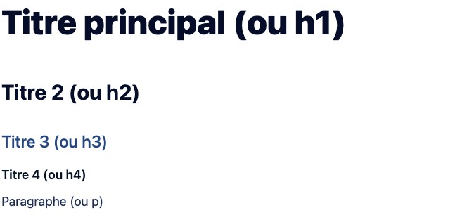
In the style guide, you must specify the typography family(ies) used. But also the size of the characters and the spacing between the lines (line spacing) and between the characters (letter spacing). It is also necessary to indicate for each element of title its size.
It is necessary to specify the different color palettes of the project. The main palette, the secondary one but also the color of the light and dark background, if there is a dark mode. For each color, it is interesting to indicate the hexadecimal code but also the RGB data. This is how colors are represented on the web.
It is interesting to display the style of the icons used with some examples. If an icon library is used, it should also be indicated and a link put.
On the style guide, the style of the buttons is displayed: shape, color, rounded. But also their animation at the passage of the mouse or at the click.
In the form part, you have to present the different fields of the form. Show if there are help texts and show how error messages are represented.
The UI design must allow to arouse emotion in the user. But if we don't know the user, we can't know what will bring him emotion.
Keep it simple but do it well. The eye must be able to see all the elements. And, to do that, the elements must be arranged and the information strategically laid out. The size of the headings plays an important role in the readability of the information and the hierarchy.
Call-to-action buttons should be integrated into the interface in a natural way. They should be visible and identifiable, but they should not intrude on the layout.
If there is a graphic charter, the colors of the interfaces must be in adequacy with those of the graphic charter. We can then use complementary, analogous or even monochromatic colors. The color wheel becomes our best ally.
However, if there is no graphic charter, then the UI designer must find the right color palettes. It is important to know that each color has a specific meaning. If we take the example of purple, it appeals to mystery, magic, and any element not natural but artificial or chemical. This color is perfect for the world of childhood or to talk about science fiction.
In limited quantity, the animations will help the user in his journey on the application or website, they will lead him to take action. They also allow to take a break in the reading of a page, especially if it is a long page.
Otherwise, if there are too many animations, the user's eye will be attracted by everything that moves and will quickly get tired. The user will be lost and will want to leave the website or the application.
The choice of the typography must be made according to the final user but also to the graphic charter. It is interesting to choose a sans serif typography for a text, it will be easier to read on small screens. Moreover, if you want to bring chic or authenticity to the interfaces, you can use a serif typeface for the titles.
The size of the typeface is a very important choice. You have to think about the reading on mobile which tires the eye more than the reading on computer.
Tip: start with a typography with a size between 12px or 14px for computer and between 14px and 16px for mobile. Then, for the color of the typography you must stay on the classic and always have a high contrast between the color of the typography and the background color.
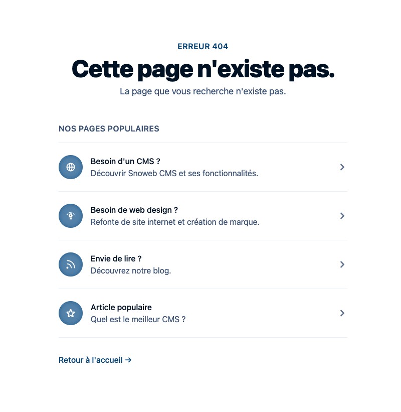
If the user falls on a 404 page, this one must redirect him elsewhere, he must not remain stuck on this page. We can therefore offer the user to return to the home page, to browse the blog or to access the services. This page must also be fun so that the user is not frustrated by an error page.
Forms should be simple and filled out with indicative information. Here are some tips:
Too often forgotten, pagination allows you to organize a page that contains many elements, such as the home page of a blog for example. If you need to display more than 10 articles on the home page of your blog, use a pagination. It will allow you to display for example 10 articles on page 1, 10 on page 2 and so on.
Thanks to pagination, the user will not be overwhelmed with information. And think about the mobile; pagination allows you to avoid having to scroll endlessly to get to the last item!
When there is an element that takes a long time to load, it is better to add a loading animation, also called "spinner". This animation will allow the user to know that the content is loading and therefore that it will be displayed soon. This avoids the user thinking that the site has crashed and that nothing will be displayed. Thanks to the loading animation, the user is more apt to wait for the content to be displayed.
Similarly, if there are files to download on a site, adding a loading bar helps the user know where the download is at.
It may seem a bit old-fashioned to talk about responsive but today, there are still sites that are not adapted to a tablet or mobile navigation.
Just like becoming a UX designer, there is no specific training to become a UI designer. The best way is to go to a graphic design school, computer graphics school or computer science and multimedia school.
I would recommend the same schools as for the UX designer training. I leave it to you to read the training to become a UX designer.
Being a good UI designer involves certain rules:
Having studied design helps a lot to be a good UI designer. These courses teach us to be rigorous, to develop our creativity, to be versatile and above all to keep an eye on things.
In the job world, the main asset is creativity! It is the only thing that makes a UI designer different from another. This creativity must be highlighted in a portfolio that reflects the character of the UI designer. Just like a client, an employer will first look at your creativity, expertise and know-how. They will make sure that you are knowledgeable, that you know your software and that you are capable of fulfilling your role as a UI designer.
Discover an interview with a UI designer!
As you could understand in this article, the UI design has a lot of importance for the user because it is what he will see. Unlike UX design, because for UX, the user does not necessarily realize the work because it is intuitive.
The subject of web design fascinates you, so these articles should interest you too.

Anne-Laure Compain

Anne-Laure Compain

Anne-Laure Compain

Anne-Laure Compain

Anne-Laure Compain

Anne-Laure Compain


4.1 How do you know when a website's UI is wrong?
There are many signs that the UI design is not optimized. I'm not going to list them all because for me, there are only two important ones:
If visitors to a website arrive on the site but do not click on any links or leave immediately, then this indicates that the site's UI is not intuitive or clear or that the user has encountered navigation problems. This is called the bounce rate. If the bounce rate is low, it means that users have had a bad experience and therefore leave the site.
Then, if on a website users browse the pages but they don't take action, i.e. they don't make a contact request, or they don't subscribe or register, it means that the UI needs to be reworked. We're talking about conversion rate here. The more users get lost on the site and don't understand the offer presented, the more the conversion rate drops.