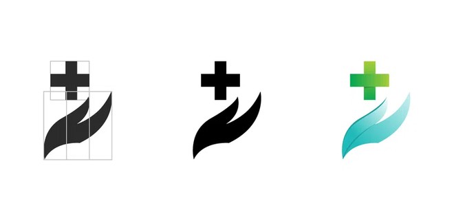
Detail of the main steps in the creation of a logo and in-depth study of the colors to use. Whether in print or web design, the logo is of great importance.

The combined logo is composed of a typography and a pictogram. These two elements can be one on top of the other, next to each other, or one below the other.
This type of logo relies entirely on typography. It is in this kind of logo that we can rework an existing typography in order to better appropriate it.
A monogram is a reduction of a company name to 2 or 3 letters, as Hewlett-Packard did with its HP logo. It is a risky choice and it is advised at the beginning, to display its name entirely below or next to the monogram so that customers can understand.
A pictogram is a logo that is represented with only one graphic element, such as the bird for Twitter or Apple's bittten apple.
The mascot logo allows you to create a fictitious character that customers will be able to relate to. This mascot will be easily used in the communication of the brand.
This type of logo appeals to a historical, retro side and is very fashionable. On the other hand, it is risky to create an emblem logo because the overload of information happens very quickly and harms the readability.
The logo of Carrefour is a very good example of an abstract logo! Everyone will see what he wants but the Carrefour logo contains at the same time a white "C", a square or an arrow!
A logo must be memorable and identifiable in a few seconds. That's why it must be simple, clear and extremely legible.
Before starting to create a logo, you must ask yourself the right questions:
Is it for print? That is to say, for use exclusively on paper such as newspapers, brochures, flyers or labels for example. Or, is my logo more for the web, for use on a website, on social media or on a blog. In this case, there are some points to remember when creating the logo! Small tips to find in the article Logo website. Finally, the logo can have a use on the print and on the web: in this case, several aspects are to be provided, we detail them below.
This step allows you to clarify the questions detailed above
It is also at this stage that we talk about the colors we like but especially the colors that will reflect the brand. Be careful, each color has a meaning, we detail it a little further.
Finally, this first step also allows you to study the competition, to know how they communicate in order to find the strong points and the weak points and to distinguish yourself from them.
Good to know: If you are working with several people on the creation of this identity, have a round table discussion! Ask several people what your activity reminds them of:
My favorite part: the research!
Here we are talking about research and selection of typography and that all !
The selection of a typography is done according to the style wanted for the logo. A more modern style, classic, childish, technological... We will choose a typography rather handwritten, with or without serifs, in capitals or in lower case. Moreover, it is interesting to work on the size and the thickness of the fonts. When I say "size" I mean the size of your letters but when I say "thickness" I mean the width of the letters. In other words, thin, normal, bold, ultra-bold, black.
This play on sizes and weights allows you to accentuate an idea for example.
Note that typography can be reworked to personalize and bring more character to a logo. But beware, only someone who knows the rules of typography and graphic design will be able to venture into this field. When you don't know the rules and you personalize a typography, it can quickly become unreadable.
To improve the understanding of a logo, it can be associated with a graphic element, also called a pictogram.
In the long term, the name of a brand can disappear to make room for the pictogram, which will become the only element of identification of the brand! This is what happened with Apple: at the mere sight of the bitten apple, we identify the brand.
Accompanying the logo with a slogan or baseline is also very common: this additional information allows to briefly summarize (in 4 or 5 words) the activity of the brand. The use of a baseline is risky because it can visually weigh down the logo and disturb the readability.
The idea is to create several graphic tracks, the maximum possible, to then be able to eliminate or evolve. This is the way to get to the end of all our ideas and especially to a well constructed logo. But be careful, this step can last a long time!
For this stage, there are several schools of thoughts. On the one hand, there are those who will work on a sketch on paper and then redesign it graphically on computer. On the other hand, there are those who will directly make sketches on the computer and then develop them on the same tool.
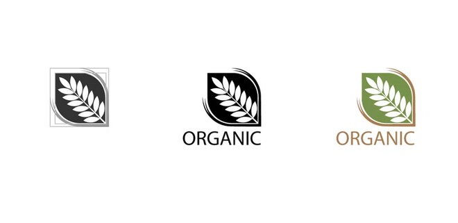
Good to know : working on a black and white logo at first allows you to concentrate on the essential and not to waste time with the colors.
We detail this step in the article website logo.
But if your logo has a main use on the web, think of creating it more horizontal than vertical so that it fits well in the header of your website. Also, when you work your colors, work them in RGB mode (red green blue) and not CMYK. The RGB mode is the colorimetric mode used on the web: it allows to have more shades of colors and more fluorescent colors. While the CMYK mode is duller because used in paper printing.
Once the logo and the colors are found, we must think about the different adaptations of the logo:
Export your logo in :
Printing the logo on paper
Export your logo in :
For a horizontal website, here are some useful dimensions in pixels (the unit used by web browsers):
Also think about the favicon (the small icon that appears at the top of a web page) with square dimensions for the creation of your website:
Facebook :
Twitter :
Instagram :
YouTube :
LinkedIn :
Once your logo is finalized, think about making your graphic charter! It will include the important elements of your logo such as color, shape and typography. The graphic charter also details the different uses of your logo and their constraints. To learn more, please read our article on the design of a graphic charter.
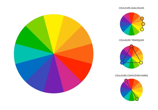
When thinking about the colors of your logo, take the time to choose colors that blend well together to highlight it. There are 3 types of associations to favor for your logo:
This color combination is quite classic. But let's say it has already proven itself. In this choice, there is little or no risk because this association of colors is widely used in the world of graphics.
We start here on an association of complementary colors with very realistic colors that can be related to elements of everyday life as :
This is our example!
Good to know: Here are the meanings of the colors blue and green
In web design and marketing, blue is used in the fields of :
In marketing and design, green will show:
This association of more natural colors reminds us of the notion of nature, earth and soil as in our example.
As detailed just above, green represents growth but above all :
While the brown represents :
This association of similar colors has a connotation of well-being and comfort because these colors, very close to each other, are soft with little contrast between them.
Some examples of use: the field of health (pharmaceuticals) or well-being (yoga or meditation).
If you are looking for a last color to add with this association: grey!
The eye must circulate and bounce between the elements of a logo in order to capture the most information. It is therefore necessary :
Do not forget the direction of reading which is in most parts of the world from left to right and from top to bottom. Arrange your logo in this direction.
The symmetry between the elements of the logo will bring a certain structure and rigor to the logo. It will give it an importance, an impression that it stands out in the world of brands. Moreover, it is very pleasant to "play" with the symmetry of the forms to create a logo.
In the basic standards, it is advised to combine a more modern sans serif typeface (without serif) with a more classic serif (with serif). But this is not an exact science! You can also combine two typefaces from the same family and play with their weights!
Once you have done your logo research, reduce the size of your logo as much as possible and see if it is still readable! Step away from your screen, take a step back from your work. If you can see all the elements and read the text clearly, then it's done!
Finally, don't hesitate to ask an external person to do this same test because you know your creations so you are not the best judge.
Contrast does not only exist on color, it also exists on shapes!
For example, a curve and a straight line or text and an illustration or a triangle and a circle form contrasts.
Good to know: To see the contrast between your colors, switch them to black and white and you'll immediately see their impact.
This association is daring and chic! Often associated with black or gray, the color gold has a very nice connotation and makes you think of the high-end, regardless of the sector. It is rarely used with dark blue and that's a shame! The depth of the blue color brings out the chic of the gold color.
A graphic designer is not only there to execute your ideas, he will also advise you on your choices and your ideas but also, on the coherence between your activity and your logo. He will also have an external look at the project and will be more likely to bring you a positive criticism of the project.
The graphic designer will provide you with HD files and in all the formats necessary for the good use of your logo; whether it is for a printer, another graphic designer, a webdesigner or a developer. Also, he will be able to work with you on the design of your business cards, flyer or on the development of your graphic charter! If you like your collaboration, he can follow you throughout your project to create content and advise you. He will also be able to put you in touch with other service providers such as a printer or a developer for your other needs.
Spend several months working on your logo yourself or have a professional and usable logo after a few days? The logo is the basic expertise of a graphic designer: he will be able to advise you and realize what you have in mind. You will also be able to exchange with him to give him feedback on his different proposals. It is in this sense that you will advance quickly on the design of the logo.
As you could see, making a logo is a long task and requires a lot of technical knowledge. Today, there are many sites that will propose you to make a logo in a few minutes. You will then have a logo :
Your logo is the profile picture of your brand, take care of it and it starts with a thoughtful creation, completed and made by an expert. On this subject, I let you discover our article which reveals you the price of a logo and advises you on the choice of your provider.
Find all our articles on the web design of your website

Anne-Laure Compain

Anne-Laure Compain

Anne-Laure Compain

Anne-Laure Compain

Anne-Laure Compain

Anne-Laure Compain

