In this article, we will review the composition of a product sheet but also analyze 20 product sheets of the most famous e-commerce sites of the moment.

Let's go back to the basics, the product sheet has been around for decades! Formerly printed on paper, the product sheet gathers all the characteristics of a product and highlights its assets. Nowadays, product sheets are still available on paper in stores, but we see more and more of them online on e-commerce.
A customer will not buy a product but the idea that this product will improve his situation. In other words, he buys the product only because it will meet one of his needs. He is only interested in what he can do with the product.
The product sheet exists so that the user can have information about the product he wants to buy. This is why making a product sheet is not a trivial task, it must meet certain editorial requirements.
The technical characteristics will group together the composition of the product, its weight, its dimensions, its shape, its color, its manufacturing method, its performance or even how it works.
The commercial characteristics are the price, the various promotions, the mode and the delivery time, the guarantees, the customer reviews, the after-sales service and finally the assistance.
The characteristics of the brand are its notoriety, its brand image, its age, the city where it is located and produced, the quantity of products manufactured and finally the respect of the standards.
Don't forget that the product sheet is perhaps the first thing the customer will see of a brand. It must make a good impression! The product sheet reflects a brand. That's why it can be minimalist or on the contrary very busy! It depends on the identity of the brand. It must also respect the constraints of the graphic charter and display the brand's logo.
Respire is a French company. It designs and sells natural, vegan and solid hygiene products. They are made in France.
✅ There are all the essentials of a product listing on the Breathe sheets and are well put forward.
The add to cart button is a bright color and the promotional aspect just above it is very eye catching.
✅ The reviews are highlighted and it also shows the total number of reviews. Also, if we click on the number of reviews, it allows us to directly read the reviews, very convenient!
✅ The strengths of the product are displayed as a list with illustrations next to it. It's very visual and comprehensive.
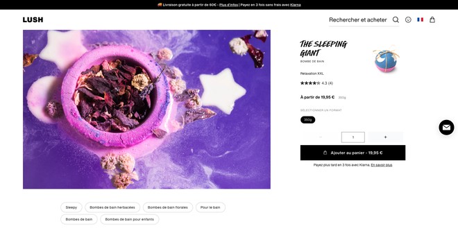
Lush is an English brand of cosmetics and body products. They mainly make solid products.
✅ The product photo is large and eye-catching. There is also a thumbnail of the product on the right side. This allows you to see what the product looks like.
✅ The description of the product is below the photo and therefore below the float line. This implies that one has to scroll through the page to read the description. It would have made sense to put a small, succinct description to the right of the product image.
❌ The price indicating "starting at" is confusing. Usually, this is put when there is a choice between two sizes or two capacities and one is more expensive than the other but here nothing like that.
Darty is a French company that sells household appliances, electronics and cultural products.
✅ The add to cart button is very visible. Also, red is a color that increases the heart rate and will create a sense of urgency, almost forcing the user to click.
✅ The highlighting is done in a list format. This is very clever! A text is easier to read as a list than as a paragraph. So the web user will want to read them.
✅ The price of insurance is well put forward and it's clear. The same goes for returns and delivery. This reassures the buyer and he is therefore more likely to add the product to the cart
❌ The product sheet is visually loaded with lots of colors
Gemmyo is a French company that creates high-end jewelry. It manufactures them, sells them on the internet but also in stores.
✅ The image of the ring and its gallery takes up more than half the page. Gemmyo chooses to highlight its products with beautiful photos where the product is highlighted.
✅ The variable part of the product sheet is well worked to allow the buyer to know e he is buying and the price difference it implies.
✅ When you scroll down the page, you will find photo and video of the product. And then more detail about the product. It's clear and very informative for the buyer.
❌ The price of the product is not highlighted enough. It is "stuck" between the title and the financing options. This is a shame.
Fnac is a French company that sells books, music, small appliances and computers.
✅ The title may not seem very comprehensive to some people, but it is perfect! The buyer looking for this type of product knows its specifics and this title will speak to them.
✅ Did you see the little "Questions and Answers" link at the top left, under the title? It's nice to put that in. This gives the buyer quick access to both reviews and also an FAQ about the product. This can clear up all his doubts.
✅ Fnac offers for this product several practical actions for the user: adding to favorites, adding to the comparator, sharing the product and finally activating an alert to let him know when the product is available again.
✅ Here, the stock is exhausted, bad luck for us! On the other hand we see very clearly thanks to the green color that the product is available in store, perfect alternative!
❌ The product images are quite small and of poor quality.
Cdiscount is a French e-commerce that offers all types of products.
✅ At Cdiscount everything is said in the title: brand, item, name, size, material, color and specificity. Do you know why this is so? For natural referencing and allow to rank well on search engines the product and also on the search engine of Cdiscount..
✅ When we arrive on the page, the first thing that the eye will see is the price and, in fact, that's what we want to know, right? And just below the payment facilities
✅ At the bottom right of the screen appeared an instant messaging window to help me with my purchase. This window appeared within 30 seconds of being on the page.
Les Minis mondes is a French company that offers eco-responsible toys for children made from recycled plastics.
There's a little bit of everything on this product page, but mostly good stuff!
✅ The product description is detailed and does a good job of explaining the product and the material it's made of
✅ The reviews under the title are retrieved via Trustpilot, a site that records and stores customer reviews. By having the reviews from this site, the buyer is convinced that they are real and verified.
✅ The reassurance elements are well highlighted and high in the page, this implies that the buyer will read them right after seeing the price.
✅ When scrolling down the page, something very very interesting happens! The add to cart button is in a fixed banner at the bottom of the screen. This implies that no matter where we are in the page, we can add the product to the cart.
❌ The two van choice buttons are more important than the add to cart button and visually they have more importance. It should have been the other way around.
❌ The customer reviews are not visible enough, because of, their green background.
Carrefour is one of the major French food brands.
✅ The "Buy" button is accompanied by a shopping cart icon. This is a good practice that helps the buyer to identify the button.
✅ There are all the mandatory data for a food product: nutritional values, ingredients, nutriscore and preservation
✅ On the side, this section of page with written in large "Your cart is empty" greatly encourages the buyer to shop.
La Redoute is a French brand of online sales of clothing, household linen and decoration.
✅ Possibility to add the product to favorites
❌ The product description is at the bottom of the page. There is a link on the top of the page to access it, but it is still complicated for the buyer to access it. This is the kind of information he needs to find at first glance.
Veepee is a French company that offers short term sales of branded products.
✅ The color of the add to cart button is the same as for the price. It's a smart choice because these two elements go hand in hand.
✅ The promotion, in green color is very visible. The crossed out price before promotion also helps to realize the importance of the promotion.
❌ The product description is not at the top of the page but under the shipping information and similar products.
Decatlon is a large French chain that sells sports equipment.
I put the entire product sheet for Decatlon because you'll see, it checks all the boxes!
✅ The title is simple and clear. It includes the important data of the product. Namely "jacket", "warm", "ski" and "black".
✅ The price is in black color on a yellow background with a bold font so it is very visible.
✅ Reviews are high up on the page and a link takes the buyer to all the written reviews.
✅ The add to cart button is not active if the buyer has not chosen the size of the garment. This practice allows the buyer to be sure to add the correct size to the cart.
✅ The text just above the size choice "Size agreed (83%)" will reassure the buyer because he will know that the jacket fits correctly. He won't have to think about what size he needs to get to fit.
✅ Then we find the benefits of the product explained in a simple way and illustrated with illustrations.
✅ Follows all the technical information, composition, maintenance, similar products and reviews.
✅ The image and video gallery is very attractive with its large images! It allows you to see the product in action.
✅ Decatlon selling products for sports and nature, adds at the end of their product sheets the environmental impact of their product. Why do they do this? Well simply because their target wants to know this kind of stuff.
Exemple de fiche produit 12
✅ On this product sheet everything is condensed on the top of the page.
✅ The whole site is black and white so the promotion and add to cart elements, in reddish and green colors respectively are very visible.
✅ The product images are very aesthetic and clean. Just like everything else on the site for that matter.
✅ An instant messaging pop up appeared at the bottom of the screen to help the buyer donate their purchase.
❌ The weight of the product takes up a lot of space, it could have been put like the flavor. So we could have used this saved space to add a short description of the product.
Leroy Merlin is a French chain of DIY and tool stores.
✅ At Leroy Merlin the products are well put forward, with beautiful photos and beautiful settings of the product.
✅ For this example of kitchen, on the right side of the image, we find all its composition. So here we can modify it, add elements or remove them.
✅ Thanks to its green color, we can clearly see the add to cart button and the delivery details.
✅ Under the basket, we also find an insert indicating the terms of installation of the kitchen at the buyer's home. For this type of product, heavy and complicated to install, the buyer needs to have this information.
❌ For a product like a kitchen, with a quantity selector is not necessarily necessary, they should do like Ikea!
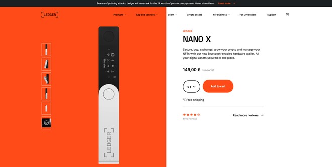
Ledger is a French startup that sells cryptocurrency wallets.
✅ At Ledger, we see life in orange! And that's perfect considering this color reflects joy, vitality and advancement.
✅ This product sheet is simple but it stands on its own.
✅ The product name is very readable and the short description says just the right thing.
✅ The quantity choice and add to cart button are clear and very visible.
✅ The fact that the cart button is the same color on the photo background makes it even more visible.
✅ The indication of free shipping reassures the buyer. The same goes for the notices.
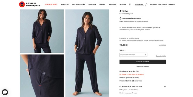
Le Slip Français is a French brand of clothing made in France.
✅ The image gallery is imposing and presents in all its custom the product.
✅ The right part remains fixed while scrolling the gallery. This is interesting because the buyer always has the important information in sight when he discovers the product images.
✅ The most visible element of the right part is the notion "In stock", which is essential for the buyer to feel like buying.
✅ The notions of local product and made in France are strong elements of reassurance for the buyer.0
❌ The description has a lot of blank areas, one wonders why. It's wasted space.
❌ It says that the pajama top is to be paired with a specific stocking but nowhere do we see its stocking or a link to buy it. Not even in the similar products.
Kuksa Shop is a French website that offers for sale authentic wooden cups handmade in Finland.
✅ On this product sheet, all the important elements are above the float line. This means that they are visible without having to scroll through the page.
✅ The image gallery is composed of 8 photos which allows you to see the product from all angles.
✅ The name of the product indicates the important notions: name of the cup, what it is and finally its capacity
✅ The reviews are put forward with green stars so it's visible.
✅ The three notions under the photo gallery are strong elements of reassurance for the buyer, it reassures him in his purchase.
✅ The notion "in stock" is important as well as the description, quality and capacity of the product. They allow the buyer to be sure of the authenticity and quality of the product.
❌ There is no link next to the reviews to encourage the buyer to read the written reviews.
❌ It is not possible to choose a quantity to buy. This must surely be done at the shopping cart level. This is quite annoying for the user, especially if he wants to add multiple items in multiple quantities. It makes him do a lot of manipulations.
Lacoste is a French company specialized in ready-to-wear clothing.
✅ When scrolling through the page, a banner comes to the bottom of the screen encouraging the buyer to put the product in the cart. Very clever!
✅ The add to cart button takes up the entire width of the section on the right. It is imposing and very visible.
✅ When we arrive on the product sheet, a small insert is displayed at the bottom of the screen to present us with a current offer. It's both discreet and intrusive.
❌ The title and price are too small. They don't stand out on the page.
Ikea is a large Swedish chain of stores that offers furniture and decoration.
✅ An add to favorites button allows you to add the product to a wish list
✅ The blue color of the add to cart button catches the eye and encourages clicking
✅ The many product photos allow you to see a lot of details and settings.
✅ On the right side, one can choose different sizes and colors for the product. When clicked, it opens a window on the side of the screen. Simple and effective.
❌ It is not possible to choose a quantity to buy. This must surely be done at the shopping cart level. This is quite annoying for the user, especially if he wants to add several items in several quantities. It makes him do many manipulations. However, for large items such as a bed or a wardrobe it is not disturbing.
Mano Mano is a French company that sells online gardening, DIY and decoration products.
Mano Mano relies heavily on its "Good to know" insert. These are essential elements for the buyer because he knows that the product is available and that, if he buys it, he will be able to exchange it if it is not suitable.
✅ The different payment methods are indicated as well as the payment facility just below the buy button. These terms will help to take action.
❌ The product images are quite small.
Petit Bateau is a French brand that sells ready-to-wear clothing for babies and children.
✅ The layout of the card is clear and simple despite a few things that need to be reviewed such as the color and size of the items.
✅ The photo gallery showcases the product well and zooming in on the images makes it easier to see details.
❌ The buttons are not legible enough. The light gray background with white text does not provide enough contrast for the eye to discern them well.
❌ The price is not highlighted enough
How about a statistical break. Since 2015, the number of people in France who buy online is constantly increasing. In 2020, there are 41.6 million French people who buy online. That's 1.5 million more than in 2019.
41,4%of buyers buy from their cell phone
84,6%of buyers buy from their computer
90%of buyers are between 25 and 49 years old
80%of transactions are made with a credit card payment
80%of deliveries are made at home
65%deliveries from are in relay point
You will see that creating an e-commerce is not simple, because the competition is tough. The product sheets are therefore all the more important! They must make you want to buy, stand out from others and sell the product extremely well. But not only! They must also comfort the buyer with reviews or secure payment methods for example.
In 2021, there were 177 000 e-commerce sites online. With in the top 5 :
Another interesting statistic is what customers want to buy! We realize that some products are more purchased in store than online, such as gardening and DIY products. Contrary to clothing, which makes more than half of its sales online.
Last point, in 2021, the average basket of an online buyer is 61€, which is +2.6% compared to 2019.
All this shows us that nowadays customers are ready to buy products online. But the market is so competitive that online stores need to be as secure and comforting as possible.
Source Médiametric - Observatoire des usages Internet T4 2020
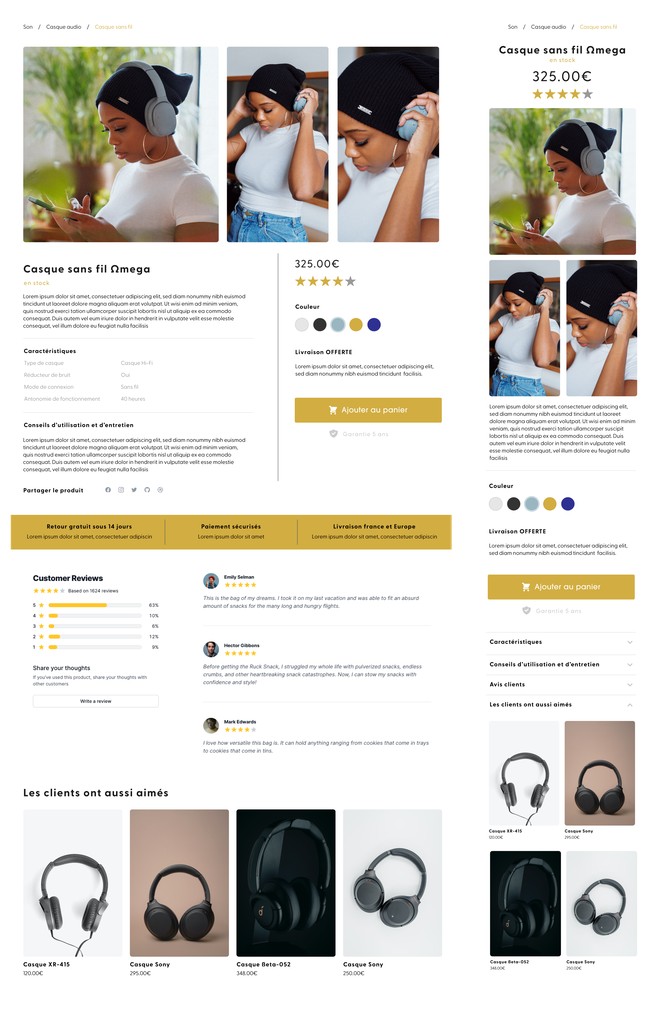
Here is an example of a product sheet that I propose to you. And we're going to dissect it together! You'll notice that I'm presenting you a web version and a mobile version! And if you read the statistics above, you know why I did this.
IMAGE & VARIATIONS
DESCRIPTION
VARIABLES
PRICE
SHARE
REINSURANCE
ADD TO CART
PAYMENTS
ADVICES
RECOMMENDED PRODUCTS
VIDEOS
FAVORITES
The subject of web design fascinates you, so these articles should interest you too.

Anne-Laure Compain

Anne-Laure Compain

Anne-Laure Compain


